Client: Mind Body Science
Product: Visual Identity
Mind Body Science App
The challenge was to create a brand identity for a new innovative fitness and wellness app.
As the name suggests, the briefing stated the app focused on 3 main pillars: Mental Health, Physical Health, and transparency.
Innovation, Resilience, and Movement were some of the keywords.
As I started working on different concepts, several ideas came to mind. The human body, the triangle and Venn Diagram were possible initial concepts that showed potencial and deeply resonated with the app's main goal.
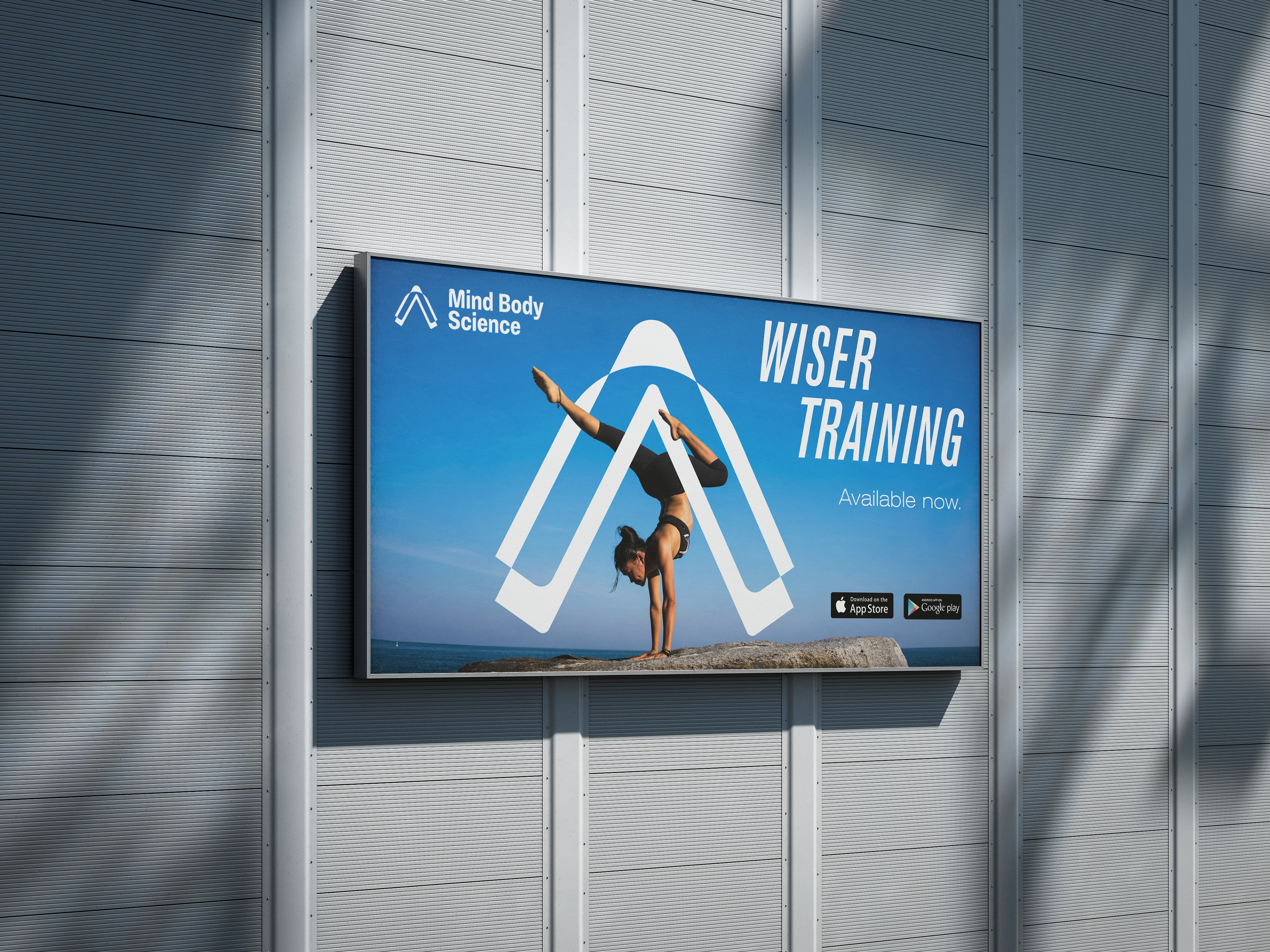
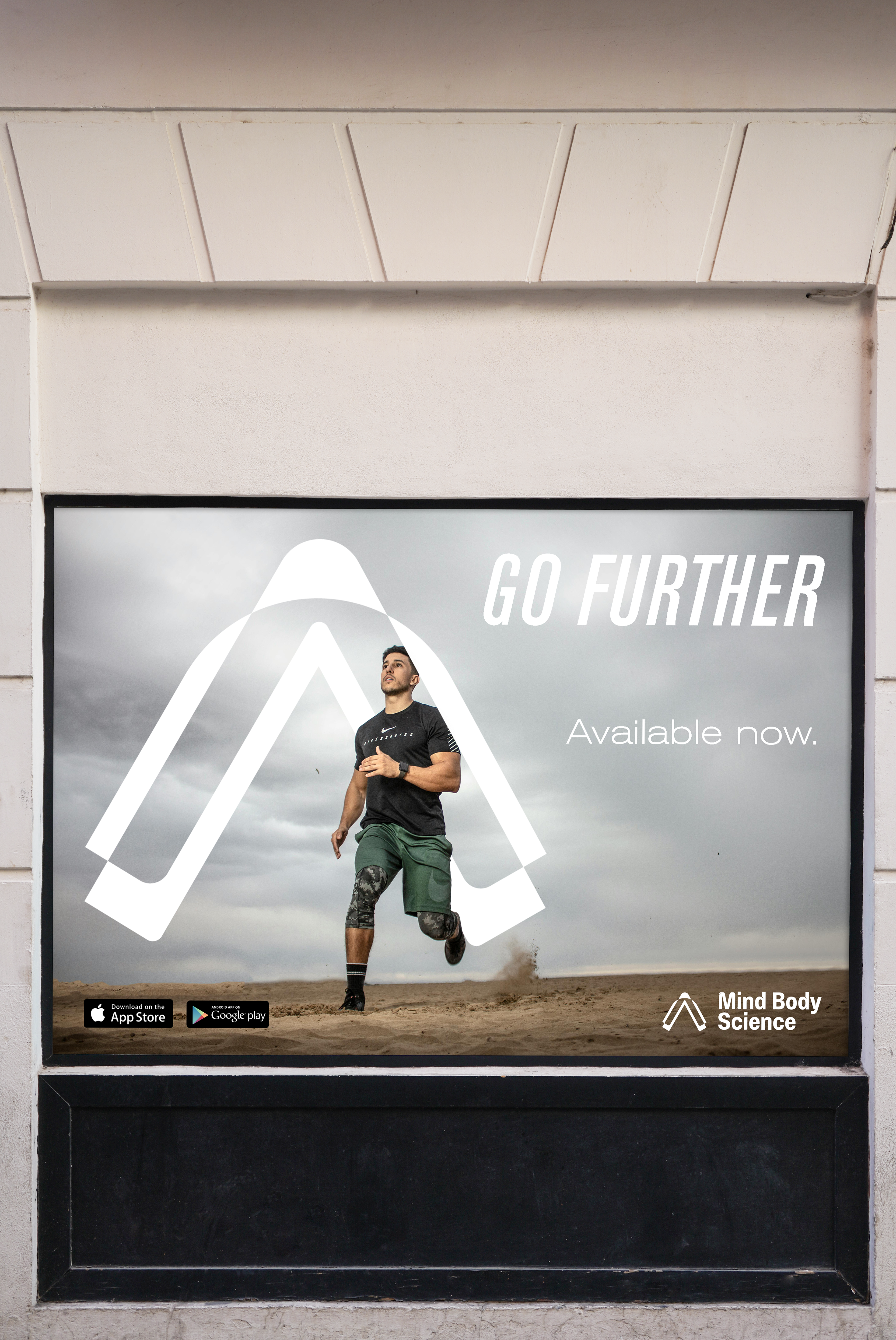
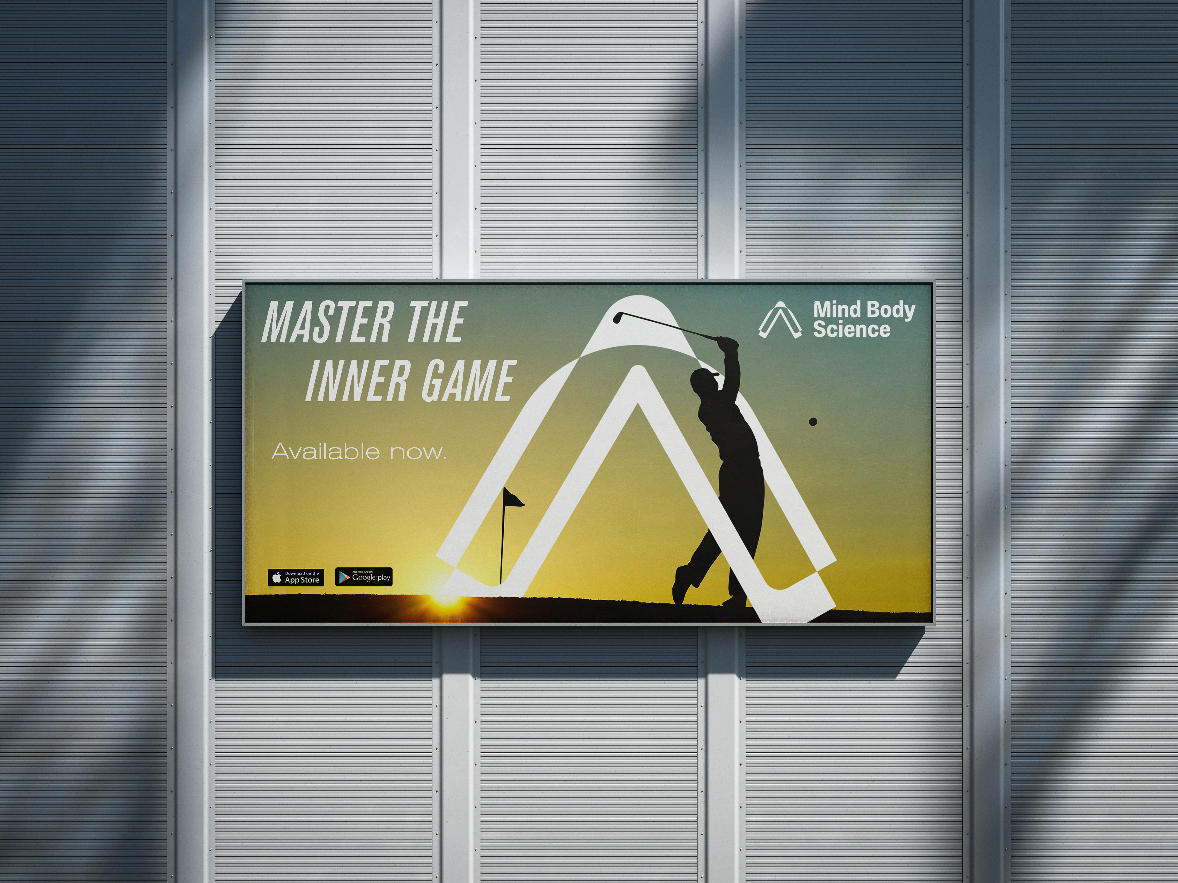
In the end, the winning concept was developed with the human proportions in mind. The triangle unites the three pillars (Mind, Body, Science) together. While the stylized arrows pointing up suggest improvement, movement and resilience. For the eagle-eyed, its negative space is also suggestive of human legs - implying once again the link to sports & fitness. The minimalist but bold logo is easily recognizable in the myriad of applications we have on our phones today.
The chosen sans-serif typeface is modern and inspires movement. It employs curved and sharped corners alike, keeping with the style of the logomark - movement and dynamism.
The logomark's negative space can eventually be adapted to create playful illustrations for the app's communication needs, enhancing the brand's boldness and memorability.
Thank you for your attention!

